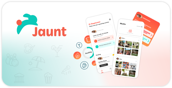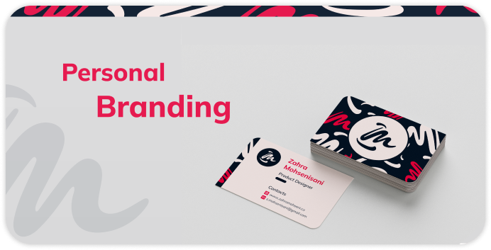

About Project:
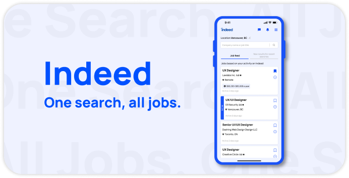
Indeed is a worldwide employment website for job listings that gives job seekers insights and tools to solve any hiring challenge and search for millions of jobs in different countries and languages. For this case study, I have chosen to focus on the user interface (UI) of the Indeed mobile app. The goal is to analyze and improve the UI aspects such as layout, typography, colour pallet, navigation, and overall user experience.
Problem:
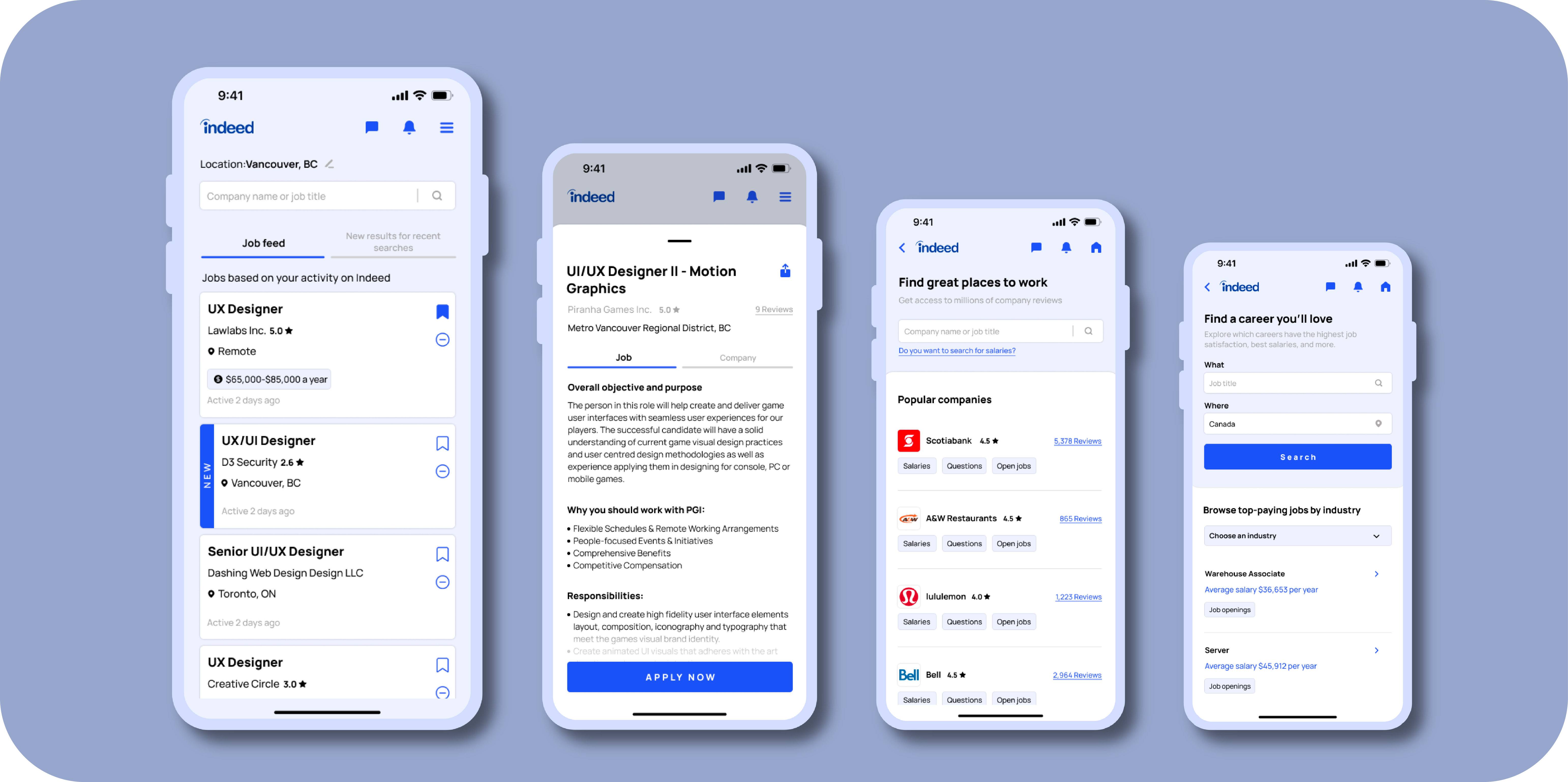
The current UI of the app feels overwhelming with too much information on the screen. This can make it challenging for users to focus on important elements and find the information they need if the design is not optimized. The most used colours are white and dark blue which make the eyes tired after a while and can pose difficulties for users with poor eyesight to distinguish different cards or sections effectively. There are also some issues with the content hierarchy that may cause users to struggle in prioritizing and accessing relevant information.
solution:
To address the challenges faced by the current interface, the overwhelming amount of information on the screen has been carefully assessed and optimized to highlight important elements and be easily accessible to users. The dominant use of white and dark blue has been also reconsidered to reduce eye fatigue and improve legibility. Applied improvements to the content hierarchy helped the app's clarity and usability.

Colour
Scheme
& Typography
Colour Scheme &
Typography
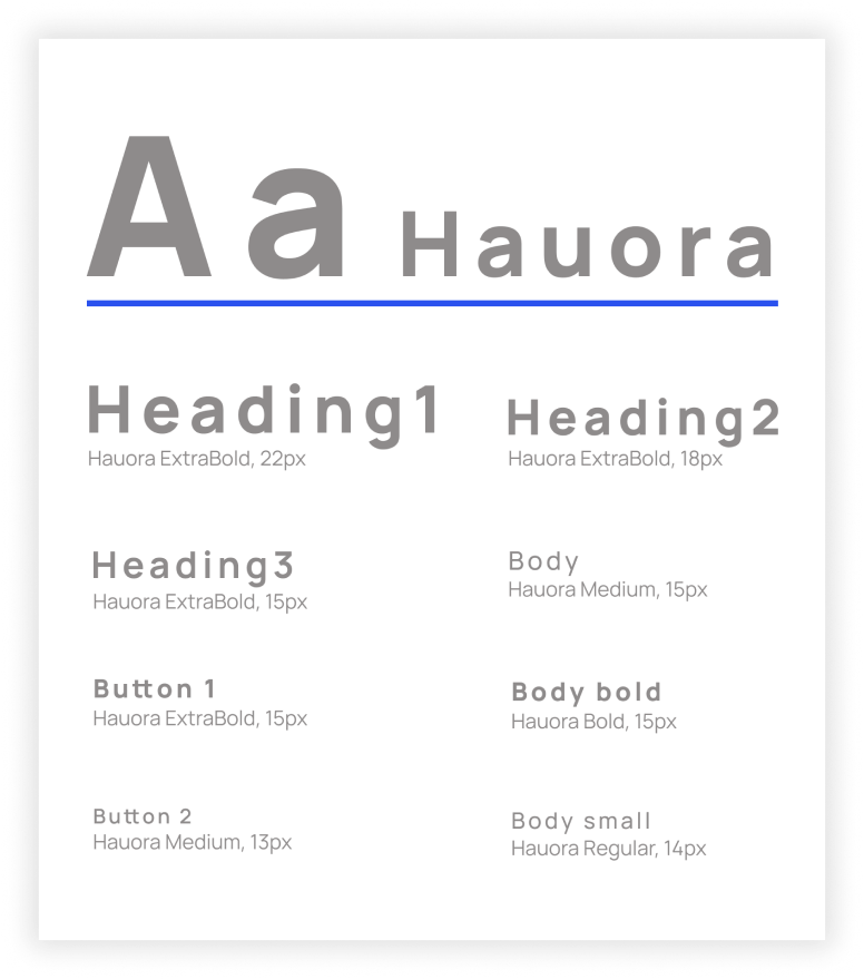
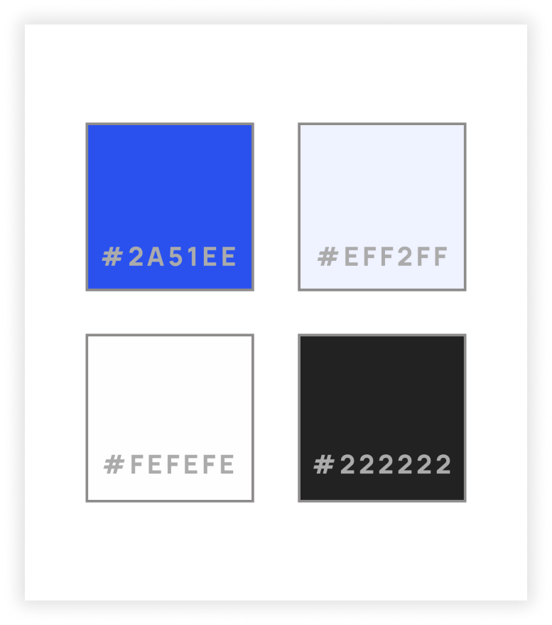
To maintain the identity of Indeed's brand, RISD Blue and Lavender have been chosen to have a more balanced and inclusive colour pallet. These two colours have enough contrast and avoid eye fatigue. For the typography Hauora has been chosen which is a modern and clean sans-serif font that is highly readable, has a consistent weight and size, and a contemporary feel.
Design Assets

Mockups
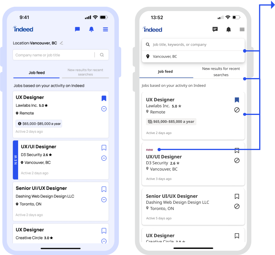


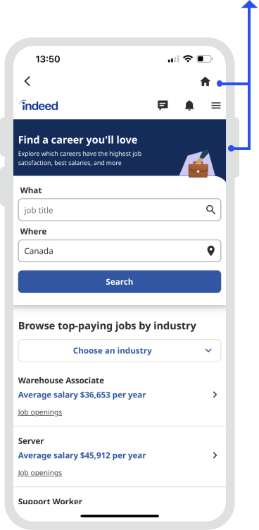
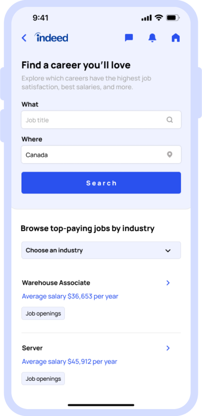
Homepage:
Redesign vs Current designThe most important things that made a huge difference between the current UI and the redesigned one on this page are the cards that have been made more contrast to the background. The "NEW" tag with blue colour was also added to the cards to be more distinguished. On the top of the page, the location has been separated from the search bar to avoid any confusion. There is also a change in the tab bar to make it more noticeable.

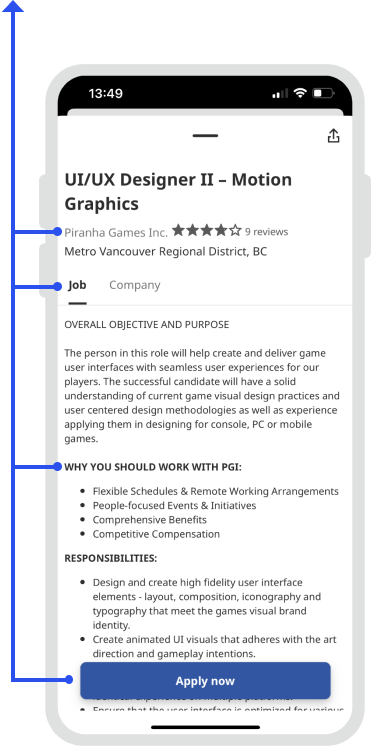
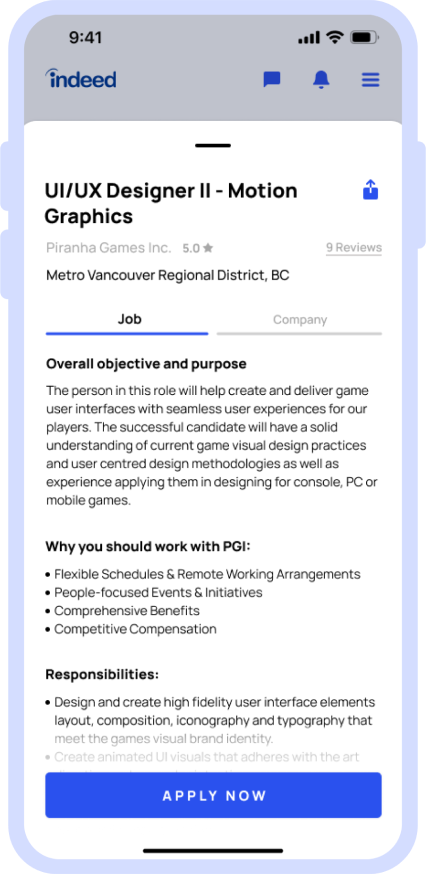
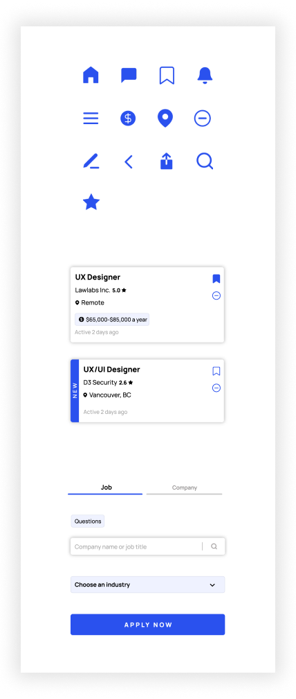
Job info page:
Redesign vs Current designThis page has some issues with the content hierarchy. It may be challenging for users to distinguish relevant information, so proper changes have been applied to improve clarity. The CTA of the current design also does not have enough contrast to attract the user's attention, so the CTA colour has been changed to make it more visible.
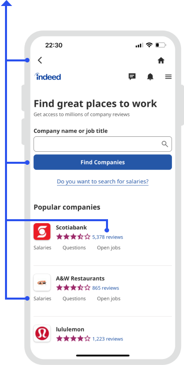
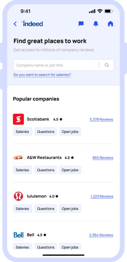
Company reviews page:
Redesign vs Current designThe most important things that made a huge difference between the current UI and the redesigned one on this page are the cards that have been made more contrast to the background. The "NEW" tag with blue colour was also added to the cards to be more distinguished. On the top of the page, the location has been separated from the search bar to avoid any confusion. There is also a change in the tab bar to make it more noticeable.

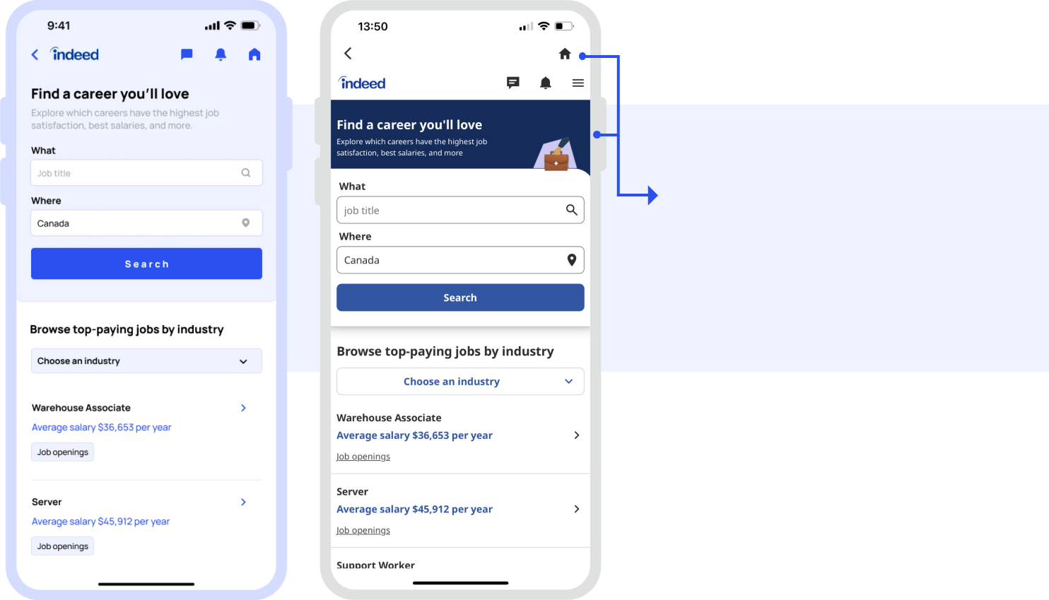
Salary guide page:
Redesign vs Current designThe most important things that made a huge difference between the current UI and the redesigned one on this page are the cards that have been made more contrast to the background. The "NEW" tag with blue colour was also added to the cards to be more distinguished. On the top of the page, the location has been separated from the search bar to avoid any confusion. There is also a change in the tab bar to make it more noticeable.
Takeaways:
This case study emphasizes that a user-friendly interface is essential for enhancing the overall user experience. By addressing challenges such as information overload and optimizing the layout and content hierarchy, users can navigate the app more easily and find what they need. The app can be more inclusive and provides a better experience for all users by considering the needs of users with poor eyesight and optimizing the colour scheme and contrast levels. By incorporating these takeaways into the redesign project, the positive impact of thoughtful UI design on user satisfaction, brand perception, and business success has been demonstrated.